|
 
|
|
ver. 2.5
|
|
CONTENTS
|
|
|
| |
Color Depth And File Size
An
Operational Level Map: Base Terrain
Adding
A Hex Grid
Adding Terrain Features
Manipulating Vector Objects
Adding
Roads And Rivers
Adding A
Rail Line
Adding Compound Terrain Features
Adding
Text
Adding
Symbols
Obtaining Symbols
Creating
And Adding Counters
Designing Counters
Creating a Counter Template
Labels
& Transparency
Counter
Rotation
Antialiasing
Creating
Charts & Tables
Moving
On
A
Tactical Level Map: More Complex Clear Terrain
Creating
ADC2 Or CB Hex Grids
Adding
Elevations
Adding
Depressions
Completing The Tactical Map
Adding
Atmospheric Effects
Creating
Your Own Patterns
Creating
Seamless Tiles
Creating Non-Seamless Patterns
Blending
Layers
Using
Textures
A Man To
Man Level Map: Using Picture Tubes
Final
Thought
|
|
If you are fortunate enough to have
a copy of Paint Shop Pro 7, you can create decent looking wargame maps and
counters in a fraction of the time required when using the CyberBoard or Aide de Camp
editors. I created the demo maps that are part of this
package in less than 3 hours. This paper will walk you through the
process and explain the techniques. Although the features of PSP7 we will
be using are somewhat "advanced", the process is not hard.
|
|
A note on Paint Shop Pro
versions: Versions 8 to
11 are now out, but I
continue to recommend version 7 (or
7.04, to be exact). Version 7.04 contains the highly useful Alien Skin EyeCandy 3.1
filters, is fast, bug-free, and uses a modest amount of RAM.
Versions 8
to 11 lack these filters, offer
little additional functionality, are noticeably
slower, somewhat buggy, and use more RAM. The
marketplace tells the story: as of Sept./07, versions 8 to 11 were selling
(new) for $17 to $60. Version 7 (new) still sells at its original price
of $100. version 7 (or
7.04, to be exact). Version 7.04 contains the highly useful Alien Skin EyeCandy 3.1
filters, is fast, bug-free, and uses a modest amount of RAM.
Versions 8
to 11 lack these filters, offer
little additional functionality, are noticeably
slower, somewhat buggy, and use more RAM. The
marketplace tells the story: as of Sept./07, versions 8 to 11 were selling
(new) for $17 to $60. Version 7 (new) still sells at its original price
of $100.
|
|
|
|
COLOR DEPTH AND FILE SIZE
|
|
|
|
Before we begin, we must address
the trade off between color depth (or density) and file size.
|
|
|
|
As you create your map using PSP7,
you will have to work entirely with a color depth of 16 million colors (24-bit
color), as many of the features we will be using are only available in this
format. This raises an issue that needs to be considered at the
outset. Will your final product be displayed in 16 million colors (24-bit
color) or in 256 colors (8-bit color)? If necessary, you can use
Colors>Decrease Color Depth>256 Colors to change the image from 16
million to 256 colors at the very end of the map creation process.
|
|
|
|
If you will be using CyberBoard,
version 2, you have no choice –  it can only display images in 256 colors. Reducing your image to
a depth of 256 colors tends to cause some loss of definition and raises the
prospect of unsightly “palette shifts”, where one or more of your chosen colors
is changed to something else you did not intend. You can minimise this
problem by always choosing colors from the CB color palette (included in this
package) and by checking the appearance of your map from time to time in the CB
Design module as you progress. Version 3 of CB uses 65535
colors (16-bit color), which largely
eliminates the
problem. it can only display images in 256 colors. Reducing your image to
a depth of 256 colors tends to cause some loss of definition and raises the
prospect of unsightly “palette shifts”, where one or more of your chosen colors
is changed to something else you did not intend. You can minimise this
problem by always choosing colors from the CB color palette (included in this
package) and by checking the appearance of your map from time to time in the CB
Design module as you progress. Version 3 of CB uses 65535
colors (16-bit color), which largely
eliminates the
problem.
|
|
|
|
Aide de Camp 2, however, IS capable
of displaying a map in 16 million colors. Use that capability if you
can.
|
|
|
|
Why would you choose to display a
map in ADC2 in just 256 colors? Because of file
size – an image with a color depth of 256 is stored in a file just 1/3 the size
of the same image in 16 million colors. Since ADC2 also limits a single
map sheet to a maximum file size of 4 MB, your map may simply be too large for
a depth of 16 million colors. To avoid this problem, you will have to
reduce to a depth of 256 colors (which poses the same disadvantages explained
above) or cut your final map into sections which are each less than 4 MB in
size, and then use ADC2’s ability to display multiple map sheets joined
together to form one large map.
|
|
|
|
It’s your call – is superior color
more important to you than file size? I would stick with 16 million
colors if at all feasible. The demo maps in this tutorial have a color depth of 16
million.
|
|
|
|
To estimate the file size of your
map, find the number of pixels it contains by 1) multiplying the number of
pixels per hex times the width in hexes, 2) multiplying the number of pixels
per hex times the height in hexes, and 3) multiplying the two resulting
products. The result is an estimate of the number of pixels, and also the
size in bytes of the image file if it has a color depth of 256. Triple
that figure to estimate the file size in 16 million colors.
|
|
|
|
Once you have made that decision,
we can begin. We will create 3 demo maps. If you make a mistake
(and if you are like me you will make a lot of them), just hit the Undo
button on the tool bar. Let's get started.
|
|
|
|
AN OPERATIONAL LEVEL MAP: BASE TERRAIN
|
|
Map graphics differ significantly
according to the scale of the map and the game. Mountains, for example,
should be portrayed differently on a map for a strategic or operational level
game than on one for a tactical level or man-to-man game. To cover the
ground thoroughly, we will walk through the creation of an operational level
map, followed by a tactical level one, and then end with a bit of practice on a
man-to-man level map.
|
|
Let's start by building a demo
map for an operational level game. Open the Operational.bmp file included in
this package and examine it – that is what we will create. Operational.bmp file included in
this package and examine it – that is what we will create.
|
|
First, we will create a new image
and cover it with our base terrain. Most of the demo map will be clear
terrain, so we will use that.
|
|
Select File>New and set
the image dimensions to 800 by 600 pixels. Use a white background
color. Make sure the image type specifies 16.7 million colors (24-bit
color). You should always work in 24-bit color even if you know
that you will be reducing the image to 8-bit color (256 colors) before using it
in CB or ADC2 or posting it
on the net. This is because many of the more advanced features of PSP7
are only available in 24-bit color mode. Click OK to create the
image.
|
|
Set the Foreground Style to
Patterns by clicking on the small black triangle and then selecting the
Pattern icon, which is the second one from the right. Click on the
current foreground pattern to display the Pattern Selector. Use
the Edit Path button to point the Pattern Selector at the folder where
you have stored the patterns in the
package that is part of this
tutorial. Then, click on the vertical bar in
the Pattern Selector window to bring up a display of the patterns we will be
using. Select the "clear" pattern. Make sure the scale is
set at 100% and the angle at 0 degrees. Click OK and the clear terrain
pattern appears as the Foreground Style.
|
|

Select the Flood Fill Tool (the paint
can) and then click on the image to fill it completely with the clear terrain
pattern.
|
|
|
|
ADDING A HEX GRID
|
|
The next step is to add a hex grid
to the image. Actually, it is best to let CB or
ADC2 draw the hex grid itself, as there are certain
advantages to that (such as the ability to use the line of sight capability in
ADC2). However, we still need a hex grid while drawing our map for the
purpose of placing objects in their proper locations.
|
|
You cannot just draw a hexagonal
pattern on the image because neither CB nor
ADC2 uses "true" hexagons (where each side has an equal length). We need
to use a hex grid which corresponds precisely with the one used by CB
or ADC2. I will describe
later how to create your own hex grid for CB or
ADC2 in your favourite size. For the time
being, we will use one of the six CB
grids (or 6 ADC2
grids) that I have already created for you.
"true" hexagons (where each side has an equal length). We need
to use a hex grid which corresponds precisely with the one used by CB
or ADC2. I will describe
later how to create your own hex grid for CB or
ADC2 in your favourite size. For the time
being, we will use one of the six CB
grids (or 6 ADC2
grids) that I have already created for you.
|
|
Use the File>Open command to open
up the file selection window. Then, open the hex grid image "CBHexGrid75Vert", a vertical grid of
75-pixel hexes.
|
|
We are going to draw the various
elements of our map in layers. This gives you far more flexibility
than just creating an image in a single raster layer. Layers can be
altered and deleted without affecting the rest of the image. The
visibility of a layer can be turned on and off, or adjusted to create special
effects. A layer can be “locked” to prevent unintended changes to
it.
|
|
Select Layers>New Raster
Layer. It is a good idea to name each of your layers; name this one
"HexGrid". After you press OK, you will have an image
containing two layers, with the hex grid layer selected. Confirm this by
opening the Layer Palette and examining it. At this point, any
changes you make in the image will only affect the current layer. Nothing
you do will alter the background layer at all.
|
|
Open the Pattern Selector
again. Scroll up to the very top of the thumbnail image display and you
will see the hex grid pattern whose image you have just opened. ANY
open image will be displayed, for
as long as it is open, in the pattern list. Any
such image can be applied as a "pattern" to another
image. The fact that the image contains some transparent portions,
as the hex grid does, does not prevent its use as a pattern.
|
|
Use the Flood Fill tool to
completely fill the new layer with the hex grid pattern. There you have
it, a 75-pixel vertical hex grid in the exact shape used by CB. This will guide us as we create the
rest of the map.
|
|
Open the Layer Palette Window and
click the small lock icon on the right hand side of the hex grid line; that
will protect this layer against any accidental changes by locking
it.
|
|
At this point, you should save the
file. Be sure to save it as a Paint Shop Pro image
(*.psp),
because this is the file format which will retain all the advanced features we
are going to use. We will change the file to a Windows bitmap eventually,
but it is very important to do all your work on a PSP7 native format file and
change it to a bitmap as the very last stage in the process.
|
|
|
|
ADDING TERRAIN FEATURES
|
|
 Let's add an
area of Rough terrain. Later, I will explain how to create your own patterns;
for now, use the ones I have made for you. Change the Foreground Style to
the Rough pattern included in this package. As always, be sure the scale
is set to 100% and the angle to 0 degrees. Let's add an
area of Rough terrain. Later, I will explain how to create your own patterns;
for now, use the ones I have made for you. Change the Foreground Style to
the Rough pattern included in this package. As always, be sure the scale
is set to 100% and the angle to 0 degrees.
|
|
Now, set the Background Style to Patterns and
then select the Rough pattern again for the Background Style. We want the
same style in both the foreground and background at this point.
|
|
We need to create a new layer but
this time it will be a vector layer (I will explain why in a minute).
Select Layers>New Vector Layer and enter the name "Terrain
Features".
|
|
Layers can be moved up and down in
the image. We want the terrain features layer to be above the background
layer but below the hex grid layer. Open the Layer Palette window and
click and drag the terrain features layer into the proper position.
|
|
We are going to draw the terrain
features as vector objects. Using vector graphics provides a lot more
flexibility than raster graphics. Vector objects can be moved,
enlarged, contracted, and pulled into a different shape easily. They are
also easier to delete if you make a mistake.
|
|
Click on the Drawing Tool,
which looks like a pencil drawing a line. Make sure the Tool
Options Window is visible, and then select the
first tab of that window. 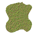 Set the type to Freehand Line, the Width to 1,
the Line Style to Style #1 Solid, and place a tick beside Antialias, Close
Path, and Create as Vector. Select the second window tab. Open the
drop-down list under "Join". Now choose the Round style and set
the Curve Tracking to 10. These are the settings we will use for creating
irregularly shaped areas of rough, mountains, forest, etc. In effect, you
are drawing a line of "rough" one pixel wide and filling in
everything enclosed by the line with a background of "rough". Set the type to Freehand Line, the Width to 1,
the Line Style to Style #1 Solid, and place a tick beside Antialias, Close
Path, and Create as Vector. Select the second window tab. Open the
drop-down list under "Join". Now choose the Round style and set
the Curve Tracking to 10. These are the settings we will use for creating
irregularly shaped areas of rough, mountains, forest, etc. In effect, you
are drawing a line of "rough" one pixel wide and filling in
everything enclosed by the line with a background of "rough".
|
|
Draw yourself a Rough area
somewhere on the map. Make it an irregular shape with lots of
indentations, etc. Don't make it too large as we have a number of
other objects to draw. Left click on the layer and trace the outline of
your Rough area. When you get back near the starting point, release the
mouse button and the line will complete itself. Do not release it too
soon as the line will be a straight line and you do not want a square edge on
your terrain. At this point, the Rough area is a vector object surrounded
by a selection box indicating that that object has been selected.
|
|
|
|
MANIPULATING VECTOR OBJECTS
|
|
To select a vector object after it
has already been deselected, use the Vector Selection tool that is the
last one on the toolbar. Alternatively, you can select the object from
the Layer Palette Window.
|
|
For practice, we will delete this
object and draw it again. Hit the Delete button and draw another
area of Rough terrain.
|
|
Now let's move the Rough area
somewhere else. Place the cursor over the selection point in the middle
of the selection box; the cursor should change into four arrows. Now
click and drag the vector object to some other part of the map.
|
|
Let's make our Rough terrain a
bit bigger. Place the cursor over the selection point in the upper right
corner. Right-click
and drag it outwards. When you release the mouse button, you will see a
larger patterned area. Now do the same thing in reverse to make it
smaller.
|
|
Want to rotate the area of Rough
terrain to a different orientation? Place the cursor over the selection
point that is immediately to the right of the central selection point.
The cursor should change into two circular arrows. Click, and then drag
the vector object in a circular rotation and it will change to a different
orientation.
|
|
You can gain even more control over
the shape of the vector object by going into Node Edit Mode.
Switch to the Vector Selection tool and select the vector object you want to
edit. Open the Tool Options window and click on Node Edit. The
vector object will change to a single line with small boxes indicating nodes
along the line. You can click and drag on any node to move it and change
the size and shape of the object. To add a node, place the cursor on the
line and press the CONTROL key. The cursor will change to the word “ADD”. Now,
left-click and a node will be added to the line.
|
|
From time to time, you may need to
make the same change (e.g., a 90-degree rotation) to each of several vector
objects. You can select several vector objects by clicking and dragging
with the Vector Selection tool, by selected individual objects while pressing
the SHIFT key, or by using Selection>Select All to select all the
vector objects in a vector layer. Then, use the Objects>Group
command to group them, after which they can all be rotated, etc., with a single
command. Use Objects>Ungroup to release them when you are
done.
|
|
Often, you will want to add a
terrain feature that is adjacent to one or two map edges. No
problem. Draw the feature in the usual manner and, when you get to the
edge of the image, just keep on drawing. Swing the line around to the
place on the edge where you want to enter the image window again and draw the
line back to near where you started. Part of the vector object is outside
the visible area, but it is all "there". If you wanted to, you
could click and drag the entire vector object into the visible area of the
image. Try this technique for the final Rough terrain area, which you
will place in the lower left corner of the map.
|
|
 Now, go ahead and
add another terrain feature to the layer. Leave the top part of the map
open as we are going to put some ocean and a coastline there. Try adding
a mountain range using one of the mountain patterns I have included.
These are handled in exactly the same way as the area of Rough
terrain. Now, go ahead and
add another terrain feature to the layer. Leave the top part of the map
open as we are going to put some ocean and a coastline there. Try adding
a mountain range using one of the mountain patterns I have included.
These are handled in exactly the same way as the area of Rough
terrain.
|
|
Next, we will add forested areas on
the right and left sides of the map. My forest pattern is partially
transparent, like the hex grid patterns, so it must be opened in its own
image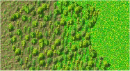 window (as you did with the hex grid). Once that is done,
the forest pattern will appear at the top of the pattern thumbnail display when
you open up the Pattern Selector. Set the forest pattern as both the
Foreground and Background pattern and then draw some forests as vector objects
in the same manner as the Rough terrain area. Draw one on top of the
Rough area to demonstrate the partial transparency of the pattern. window (as you did with the hex grid). Once that is done,
the forest pattern will appear at the top of the pattern thumbnail display when
you open up the Pattern Selector. Set the forest pattern as both the
Foreground and Background pattern and then draw some forests as vector objects
in the same manner as the Rough terrain area. Draw one on top of the
Rough area to demonstrate the partial transparency of the pattern.
|
|
 Use the Town pattern to add an urban area. There
are a number of other patterns I have provided; their purposes are obvious from
the file names. Save the file. Use the Town pattern to add an urban area. There
are a number of other patterns I have provided; their purposes are obvious from
the file names. Save the file.
|
|
ADDING ROADS AND RIVERS
|
|
Let's add a river. Set
the Foreground Pattern to Deep Water. Set the Background Pattern to None
(select the null indicator on the far right of the small window that opens when
you click the black triangle). Open up the Tool Options window, select
the left-hand tab, and set the Line Width to 20 pixels. This time, clear
the check box beside Close Path. Leave everything else as it
is.
|
|
Move the cursor down to the bottom
of the image then click and drag towards the top to create the river. Be
sure to include some realistic twists and turns. After you have created
it, you will find that it doesn't quite join the bottom edge correctly; it
doesn't look like it flows off the bottom edge. To rectify this,
click and drag the selection point in the centre of the object and move the
river down until the appearance is correct.
|
|
Let's draw a paved road from
right to left across the upper part of the map and across the river. We need to
make sure that the river vector object is no longer selected.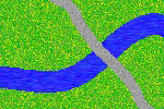 Use Selections>Select
None to get rid of the selection box. Set the Foreground Style to
Paved Roads and the Line Width to 10. Leave everything else alone.
Draw yourself a road that starts at one side of the Window and runs off the
opposite side. Move the cursor a few pixels past the edge of the window
so as to create the impression the road is running "off" the edge of
the image. These lines you have drawn are vector objects and can be
grouped, moved, rotated, enlarged, contracted, and deleted in the same way I
have described before. Use Selections>Select
None to get rid of the selection box. Set the Foreground Style to
Paved Roads and the Line Width to 10. Leave everything else alone.
Draw yourself a road that starts at one side of the Window and runs off the
opposite side. Move the cursor a few pixels past the edge of the window
so as to create the impression the road is running "off" the edge of
the image. These lines you have drawn are vector objects and can be
grouped, moved, rotated, enlarged, contracted, and deleted in the same way I
have described before.
|
|
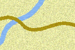
As you can see, where it crosses
the river, the road is on top. But let's assume that you had drawn
the road first and, when you drew the river, you found that it was flowing over
the road. Unless you want a washed out road, this needs to be
fixed. It's simple.
|
|
The answer is to move the road
vector object to a higher position in the layer hierarchy than the river vector
object. Let's see how this works.
|
|
Open up the Layer Palette Window
and click on the plus sign to the left of the Terrain Features layer.
This opens up a list of the vector objects you have created but, at the moment,
each one is called "Freehand". You can, and probably should,
rename these, which you can do by right-clicking on "Freehand" and
selecting the Rename menu option.
|
|
When you rest the cursor on the
line for a vector object for a couple of seconds, a small window opens up which
shows you the vector image. Use this feature to locate the road
image. For practice, click and drag it down below the river vector image
in the Layer Palette Window hierarchy. When you release the mouse button,
presto!, the road is now
underneath the river. Click and drag the road back into its proper
position.
|
|
 Use Selections>Select
None to get rid of the selection box and then use the Dirt Roads pattern to
draw yourself a dirt road feeding into the paved road. Save the
file. Use Selections>Select
None to get rid of the selection box and then use the Dirt Roads pattern to
draw yourself a dirt road feeding into the paved road. Save the
file.
|
|
|
|
ADDING
A RAIL LINE
|
|
A railway line can be added to the
map in exactly the same way as a road or river. The only difference is
you need to use a "Custom Line" that resembles railway tracks.
I have included one for you in the Styled Lines folder. Use the
File>Preferences>File Locations>Styled Lines command to point
at the Styled Lines folder I have provided. Set the Foreground Style to
Color and select a suitable dark brown color.
|
|
This time, set the Line Type in the
Tool Options Window to Point to Point and the Line Width to 2. Select the
drop down list under Line Style and scroll down to select the Railway
style. Check the Antialias box but leave the Close Path box
unchecked.
|
|
Click at the left edge of the Image
Window to start drawing the line. 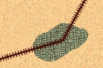 Move
right and down, then click again to end the first track section. Each
time you click on the map a node is added to mark where the section in question
will end. The last node should be placed just below the bottom edge of
the image window. If you want to add a curved section of track, left click and
then drag to draw a curve in the line section that ENDS where you have just
clicked. Move
right and down, then click again to end the first track section. Each
time you click on the map a node is added to mark where the section in question
will end. The last node should be placed just below the bottom edge of
the image window. If you want to add a curved section of track, left click and
then drag to draw a curve in the line section that ENDS where you have just
clicked.
|
|
Press CONTROL Q to end the line
drawing process.
|
|
|
|
ADDING COMPOUND TERRAIN FEATURES
|
|
I use the phrase "compound
terrain feature" to refer to a vector object which contains a
foreground pattern of one thing and a background pattern of another. Let
me illustrate.
|
|
We will draw ourselves a coastline
- a body of deep water fringed by a sandy beach. Set the Foreground
pattern to Desert, set the Background Style to Patterns, and then set the
Background pattern to Deep Water. In the Tool Options window, set the
Line Width to 15 pixels (the width of the beach) and tick off the Close Path
box. Leave everything else alone.
|
|
 Now we will draw our
coastline. Starting from the right hand side of the image near the top,
draw an undulating line across the map to the left side. When you get to
the left side just keep on going off the edge of the image and then, still
holding the left mouse button down, swing the cursor above the top border of
the image all the way over to the right hand side and down close to where you
started. Then release it. At this point you have a coastline vector
object (a "compound terrain feature") which is partly inside and
partly outside the image. As usual, it can be moved, rotated, enlarged,
etc. Now we will draw our
coastline. Starting from the right hand side of the image near the top,
draw an undulating line across the map to the left side. When you get to
the left side just keep on going off the edge of the image and then, still
holding the left mouse button down, swing the cursor above the top border of
the image all the way over to the right hand side and down close to where you
started. Then release it. At this point you have a coastline vector
object (a "compound terrain feature") which is partly inside and
partly outside the image. As usual, it can be moved, rotated, enlarged,
etc.
|
|
Let's draw one more compound
terrain feature to make sure you've got the concept. Set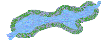 the foreground
pattern to Marsh, the background pattern to Shallow Water, and the Line Width
to 10. Make sure Close Path is checked. Draw yourself a shallow
lake fringed by marsh. the foreground
pattern to Marsh, the background pattern to Shallow Water, and the Line Width
to 10. Make sure Close Path is checked. Draw yourself a shallow
lake fringed by marsh.
|
|
Now, uncheck the Close Path box,
set the Foreground pattern to Shallow Water and the
Background pattern to Null, and draw a stream flowing from the marsh to the
near edge of the map. Save the file.
|
|
|
|
ADDING
TEXT
|
|
Let's add some text to label a
couple of features and give the map a name.
|
|
Create a new vector layer called
"Text". Move it to a position above the terrain features layer
and the hex grid layer. All text will be created as vector
objects. This allows you to manipulate text objects in any and all of
the ways described earlier. For example, you could Group a number of text
objects and then rotate them all with a single command.
|
|
 Let's
give a name to the urban area. Click on the Text Tool (a capital
A). Click on the layer somewhere near the town you have drawn; it
doesn't matter exactly where you click - because this is a vector object,
it can be easily moved after you create it. Let's
give a name to the urban area. Click on the Text Tool (a capital
A). Click on the layer somewhere near the town you have drawn; it
doesn't matter exactly where you click - because this is a vector object,
it can be easily moved after you create it.
|
|
Set the font to Arial (a nice, clean
font with good visibility), the size to 9, and click
the Standard Text button. Click on the Fill Color to open up the Color
Palette and then choose pure black. You can set this numerically by
setting Red = 0, Green = 0, and Blue = 0. This is called the “RGB
Value”.
|
|
Fill in the name of your town in the
large text box and choose Create as Vector. Check the Antialias check box. Leave
Auto Kern turned off. You may wish to make the text Bold by clicking the
Bold button.
|
|
When you click OK, the text will appear
as a vector object on the layer. Move it into position and deselect
it. If you don't like its position, you can always select it again
and move it.
|
|
If you want to change the font, text
size, etc., then select the text vector object, click on the Text Tool, and
place the cursor over the object. When the cursor changes to display a
capital A, click again and the text entry box will open up. You can now
make your changes.
|
|
Let's add a map name in the upper
left corner. Click there with the Text Tool. This time,
set the size to
18. Set the Fill Color to pure white (RGB = 255, 255, 255). Save
the file. the size to
18. Set the Fill Color to pure white (RGB = 255, 255, 255). Save
the file.
|
|
ADDING SYMBOLS
|
|
Let's add a couple of graphic
symbols to the map to liven it up a bit.
|
|
Create a new raster layer called
"Symbols" and position it above the Terrain Features layer but below
the hex grid layer. Go into the folder where you have stored the symbols
included with this tutorial and select the symbol called "airfield1". After it
opens in its own image window, hit the Copy button to copy it to the
Clipboard. Then, switch back to the demo map image and select
Edit>Paste>As New Selection. The symbol appears on the tip
of your cursor and you can now click on the layer to position it. Click
Selections>Select None to remove the marquee.
|
|
As you can see, this symbol image is
partly transparent; that gives it a natural look against the background.
Save the file.
|
|
     
|
|
|
|
OBTAINING SYMBOLS
|
|
Where do we get symbols from?
Assuming you are as artistically challenged as I am, drawing them ourselves is
not really an option.
|
|
A variety of symbols are available on
the Internet, but the best ones can usually be found in old computer
wargames. This raises aspects of copyright law which are beyond the scope
of this tutorial.
Suffice it to say that lifting a few small symbols from an old, out of print
wargame that is no longer available commercially is not likely to offend
anyone.
|
|
Let's assume you have an old
wargame with some useful symbols. The first step is to use PSP7 to do a
screen capture of the symbol.
|
|
Run PSP7, select
File>Import>Screen Capture>Set Up, and then set the capture
value to "Area" and the hot key to F11 (or F12). Click the
Capture Now button and PSP7 will minimise itself and run in the
background.
|
|
Next, run your wargame and bring up on
the screen a scene that includes the symbol or symbols you want to
capture. When you are ready, hit F11 and the cursor will change.
Left click a little above and to the left of the image area you want to capture
and the cursor will change again. You will see a rubber-band selection
box with some numbers in it. These numbers tell you the size, in pixels,
of the capture area. Expand the selection box until it is past the lower
right corner of the area you want. Then, click again and PSP7 will
maximise itself and display the selected area in a separate image. You
can now save this image to disk.
|
|
The next step is to zoom in and select
a rectangular area that includes only the symbol you want. When you have
it, hit the Copy button to copy the image to the Clipboard and the Paste button
to paste it into a separate image.
|
|
Next, you need to isolate the portion
of the symbol you want and render the rest of the image transparent.
Select Layers>Promote to Layer to enable yourself to use
transparency. The area you want to make transparent will probably be an
irregular shape, so use the Magic Wand to select the first such
area. You will probably have to play with the Magic Wand Tolerance
settings a bit before you get the selection correct;
start at Tolerance=0 and slowly increase it if necessary. This takes a bit of practice. Leave the Match Mode at
"RGB Value" and
Feathering at 0. Clear the box for Sample Merged.
|
|
Once you have made a correct selection
of the first area to be rendered transparent, you need to extend that to the
other similar areas in the image. (Here, I am assuming that all of the
background you wish to make transparent has similar RGB values, i.e., is a
similar "color"). To do this, choose
Selections>Modify>Select Similar. This should extend the
selection to all portions of the image that are similar. If it
doesn't work, you will have to play with the Magic Wand Tolerance setting
or select them individually. (Note that
"Select Similar" uses the Magic Wand Tolerance setting.)
|
|
Now hit the Delete button and the
selected areas will be replaced with transparency. Save the symbol to
disk as a Paint Shop Pro (*.psp) file. That's it! You now have an image that you can
use repeatedly on your maps.
Another good alternative, if
you own a copy of Corel Draw, is to use the 2 TrueType symbol sets
included in that package: the "Military" set contains symbols of
tanks, planes, artillery pieces, etc., and the "Military ID"
set contains NATO symbols. Once Corel Draw is installed, these symbol
sets should show up as fonts in PSP7.
You "write" the
symbol onto the map or counter using the Text tool. Create the symbol as
a Vector, so you can scale it afterwards. In the Text Entry window,
select the symbol set, set the size, and then press the key for the
symbol you want.
You can get an image of all
the symbols in the set in MS Word from the Insert>Symbol menu
item. By comparing this image to one of an ordinary alphabet font (do
screen captures and print them out), you can infer which key to press for a
particular symbol.
|
|
CREATING AND ADDING COUNTERS
|
|
Let's make a couple of
counters. We will also add them to the demo map although, when we finally
save the map for use in CB or ADC2, we will render the counters invisible at that point. The
counters you create will be saved as separate files and can be imported
into into CB using the Design Module or
into ADC2 using its Symbol Editor.
|
|
Go to the folder where you have stored
the counters and counter templates that are part of this tutorial. Select
CounterTemplate50.bmp,
which is 50 pixels square
and the right size for a 75 pixel hex grid (if there
is no stacking of counters - see below).
|
|
The template is gray, but you can easily change the
color. Select the Dropper Tool and right click on the
gray to make it the Background
Color. Set the Foreground Style to Solid Color, click on the Style box to open up the
Color Palette, and choose the color you want. Then, select PSP7's
Color Replacer Tool, set its Tolerance to 0, and double click on the
image. The gray color
will be replaced with your selection.
|
|
You can easily draw standard NATO
symbols in the square outline I have provided on the template.
|
|
As an alternative, you can erase the
square (select it with the Magic Wand and then replace it with the color of the
rest of the counter) and add a symbol to the counter. Load the tank
symbol file included with this tutorial
and place the tank image on the centre of the counter in the
same way you earlier placed symbols on the map. Then, use what you
learned earlier to place text on the counter (I suggest Arial, size
9, Antialiasing on, no Bold). I have included four
sample counters in two colors in the package.
|
|
   
|
|
Counters look better if they are
"Buttonized". This gives them a bit of a 3D look that is
similar to the appearance of a cardboard counter on a paper
map.
|
|
First, you should set the Background
Style to Solid Color and the Background color to RGB=192, 192, 192
(gray). You can buttonize the Background layer (i.e. a raster layer) of
the counter by selecting Effects>3D Effects>Buttonize. This
opens up the Buttonize window. Set the values to:
|
|
Height = 2 pixels
Width = 2 pixels
Opacity = 100
Solid Edge
|
|
|
|
When you have created your counter,
save it to disk as a Windows bitmap (*.bmp) file because you will want it in
this format in order to import it into the CB Design Module or ADC2 Symbol Editor.
|
|
Let's add some counters to the map
to see what they look like on the map. Create a new raster layer called
"Counters". Place it at the top of the layer hierarchy, above
the HexGrid layer. Load a counter as a separate image, hit Copy to copy
it to the Clipboard, and then Edit>Paste>As New Selection to paste
it on the layer where you want it.
|
|
You can add some of my sample counters
as well. Save the file.
|
|
DESIGNING COUNTERS
We now need to take a more
detailed look at designing and creating counters.
The first question is counter
size.
Wargame maps and counters seem to
look best on a computer screen, most of the time, when they are displayed at
the same size as the cardboard maps and counters they represent. A good,
average screen resolution suitable for most monitors these days is 100
pixels per inch. We will use that as our standard.
Many typical wargames use a hex
size of ¾ inch; translated to the computer screen, that equals a hex size of 75
pixels. Most counters are square. The largest square counter that
will fit into a 75-pixel hexagon without overflowing the edges is 56 x 56
pixels. equals a hex size of 75
pixels. Most counters are square. The largest square counter that
will fit into a 75-pixel hexagon without overflowing the edges is 56 x 56
pixels.
That represents about 75% of the
hex size. More generally, we can adopt the rule that a square counter
should have a maximum size = 75% of the hex size if it is to fit
comfortably inside the hex.
Most wargames allow counter
stacking. CyberBoard illustrates stacked counters by offsetting each such
counter after the first by 3 pixels horizontally and vertically when you use
the AutoStack feature.  (The offset value can be changed by the scenario
designer in CB’s Play module.) Assuming you do not want a stack image to
overflow the hex outline, you need to take stacking into account in
deciding upon counter size. You must estimate the largest number of
counters a player will typically have stacked in a single hex. Then,
maximum counter size can be calculated by this formula: (The offset value can be changed by the scenario
designer in CB’s Play module.) Assuming you do not want a stack image to
overflow the hex outline, you need to take stacking into account in
deciding upon counter size. You must estimate the largest number of
counters a player will typically have stacked in a single hex. Then,
maximum counter size can be calculated by this formula:
MaxCounterSize = (HexSizeInPixels *
.75) – (3 * (NumCountersInStack – 1))
For example, for a 75-pixel hex
size where the stacking limit is 3 counters, maximum counter size would be (75
* .75) – (3 * (3 – 1)) = 50 x 50 pixels. That is the size of a ½ inch
counter displayed on the screen at 100 pixels per inch. 
How do you fit all the data a
counter might contain onto an image of 50 x 50 pixels? Good
question. Buttonizing uses up 4 pixels in each dimension, so the usable
counter real estate is reduced to 46 x 46 – not a lot, considering how much
data is sometimes found on a counter.
You must select a font, size,
style & color for each of the data items on the counter.
Legibility is critical. I have found that Arial is a clean
font with good legibility at  small sizes, but by all means try out others. As for size, the
smallest provided by PSP, size 8, is generally the most useful.
(Other designers may disagree – some have used fonts as small as size 6
successfully.) Data items can be distinguished from each other by text
color, Bold characters, and position on the counter; often, you will use all
3. Color is particularly useful, as it does not increase the space
consumed by the text (unlike Bolding). small sizes, but by all means try out others. As for size, the
smallest provided by PSP, size 8, is generally the most useful.
(Other designers may disagree – some have used fonts as small as size 6
successfully.) Data items can be distinguished from each other by text
color, Bold characters, and position on the counter; often, you will use all
3. Color is particularly useful, as it does not increase the space
consumed by the text (unlike Bolding).
Things can get pretty crowded on the
counter. There are several things you can do to conserve space.
First, be aware that Bold text takes up slightly more room than normal
text. Second, you should familiarize yourself with the effects of
“kerning” and “leading”, two adjustments you can make to text in
PSP’s Text Entry Window. Kerning adjustments push the characters
closer together or spread them further apart horizontally; leading does the same in the vertical dimension.
Kerning and leading are the keys to making decent looking counters with a lot
of data on them. As always, experiment and take
notes. I have found a leading value of minus 3 to be generally useful;
try minus 25 as a starting point for a kerning adjustment. One alternative to a negative kerning value is to use the
Arial Narrow font, which accomplishes the same thing. Arial Narrow
is the rough equivalent of setting kerning = - 25 for size 8.
CREATING A COUNTER TEMPLATE
Let’s work through the process for
our typical 50 x 50 pixel counter. The first step is to create a
counter template which will be used as the starting point for each
individual counter. That will both speed up the process and ensure that
the counters have a consistent style.
Open a new image of 50 x 50
pixels, flood fill it with a background color, then buttonize it as explained
above. Create a new vector layer on top of the buttonized
background. Save the image as a *.psp file.
Now, set the background color to
your chosen text color (usually black) and the foreground color to
nothing. Select the Text Tool and click on the image to open up the Text
Entry Window. It is in this window that you will make all the font, size,
color, kerning, leading, bolding and antialiasing adjustments described
above.
Set these values:
font = Arial
size = 8
Bold = off
Alignment = Left
Create as Vector = on
antialiasing = on
Note that the Text Entry Window
allows you to set Left, Right or Center Alignment for the text: these
buttons align the text with itself so that, for example, a column of
numbers can all be aligned to the left. From the Objects Menu, you can
select the Align>Center in Canvas, Align>Horizontal
Center in Canvas and
Align>Vertical Center in Canvas commands to align
the text in relation to the counter. Each of these alignment
methods is highly useful.
Type a column of 2-digit numbers 4
rows high and click OK to close the Window.
Use Objects>Align>Center in
Canvas to center the text on the counter. Zoom in to 12:1. We see
immediately that the text is too long in the vertical dimension. Place
the cursor over the text object until an “A” appears as the cursor, then click
to reopen the Text Entry Window. Set Leading = -3, close the window, and
align the text in the center of the canvas again. Now it is spaced so as
to fit nicely on the counter.
Hold the SHIFT key down and press
the Left Arrow key to “nudge” the text towards the left edge of the
counter. Check its appearance by zooming out to 1:1.
Let’s do something to make the
more significant data items stand out. Reopen the Text Entry Window for
the left hand column, highlight one row, click the Bold button, and close the
window. This will Bold that row while leaving the other numbers
unchanged. In other words, you can Bold selected
parts of a single text object.
Now, we will place a similar
column of text on the right side of the counter. This time, we want to
use different colors for each item, so we create 4 separate text objects in 4
different colors. Use the Object
Selection Tool to pull them into approximate positions, then select
Objects>Align>Right to align them with each other. At this
point, if you have zoomed in to 12:1, you can align their bottoms by eye with
the text on the left. colors. Use the Object
Selection Tool to pull them into approximate positions, then select
Objects>Align>Right to align them with each other. At this
point, if you have zoomed in to 12:1, you can align their bottoms by eye with
the text on the left.
Once you have all the data
arranged on a counter the way you want it, save the result as a template.
Typically, you need to create a number of counters of similar appearance with
only 1 or 2 data items changing from counter to counter. Each successive
counter can be created quickly by duplicating the template (use
Window>Duplicate), double-clicking on the relevant text object in the
Layer Palette and changing the text. Then, you can use Edit>Copy
Merged to copy the counter to the Clipboard, switch to CyberBoard, and
Paste the image into a new “tile”.
Creating counters can be tedious
in the extreme. You owe it to yourself to think through the process and
do everything possible to shorten the sequence of mouse clicks. I
recommend adding the most often used commands, such as Center on Canvas, Copy
Merged, and Select None, to the toolbar (use
View>Toolbars>Customize). Simple preparation of this sort can
save you many mouse clicks. (If you need to perform a certain action on
each of a large number of counters (e.g., buttonizing), you should consider
using PSP8 or 9, which add scripting as a new
feature.)
LABELS & TRANSPARENCY
When it comes to creating game
markers, give some thought to making use of the advantages of the
computer. CyberBoard supports transparency in both “pieces” and
“markers.” The default transparent “color” is cyan, RGB=0/255/255.
The
typical cardboard game marker is the same size as a unit and covers it
completely. A more useful approach, in CyberBoard, is to create a
partially transparent “counter” which allows some of the underlying
image (the unit it is marking) to show through. I call this a “label.” Much
of the time, a player will not have to select and move a label to determine
what unit is sitting underneath. 
The
technique is simple. Just flood fill the bottom layer with the cyan color and any areas where it shows through will display as
transparent in CB.
You can also use transparency to
advantage when you need to use multiple labels which will sit on top of a
single unit. For  example, if you had 4 different status indicators, all of which might be
displayed on a unit simultaneously, you could create a transparent square with
an opaque border and place the 1st label type in the upper left
quarter, the 2nd in the upper right quarter, etc. Even when
all 4 labels are example, if you had 4 different status indicators, all of which might be
displayed on a unit simultaneously, you could create a transparent square with
an opaque border and place the 1st label type in the upper left
quarter, the 2nd in the upper right quarter, etc. Even when
all 4 labels are sitting on
top of each other on the counter, the 4 indicators will all be
visible. (They will, however, be misaligned unless you set the
offset value to 0 when creating the scenario in CB.) sitting on
top of each other on the counter, the 4 indicators will all be
visible. (They will, however, be misaligned unless you set the
offset value to 0 when creating the scenario in CB.)
Some labelling can also be done on
the counter itself. The standard counter image offset in CB is 3 pixels
horizontally and  vertically;
buttonizing requires a 2-pixel border all around. That leaves the
3rd row of pixels available to indicate, for example, a unit’s
command affiliation. If you assign distinct colors to units in different
commands and draw a 1-pixel wide square 3 rows in, that color will show up in
CB when vertically;
buttonizing requires a 2-pixel border all around. That leaves the
3rd row of pixels available to indicate, for example, a unit’s
command affiliation. If you assign distinct colors to units in different
commands and draw a 1-pixel wide square 3 rows in, that color will show up in
CB when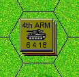 the unit is
buried in a stack (assuming CB’s offset value = 3). the unit is
buried in a stack (assuming CB’s offset value = 3).
Some board
games expect a player to keep track of the
changing status of a unit, such as a ship, on a log sheet. You can
usually substitute a screen display for the log sheet, using tracks
with  letters or
numbers and a label to indicate the current value. A square label with a
4-pixel wide border and a transparent center will work well to highlight a given position on a track. letters or
numbers and a label to indicate the current value. A square label with a
4-pixel wide border and a transparent center will work well to highlight a given position on a track.
Labels can also be used to
good effect on a map. The changing status of a hex, for example from clear terrain to cratered, can be marked by
dragging a label onto it. The label can indicate the current and former
terrain type simultaneously by the use of transparency. example from clear terrain to cratered, can be marked by
dragging a label onto it. The label can indicate the current and former
terrain type simultaneously by the use of transparency.
Give some thought to how labelling and
transparency can make things easier for the player. Take advantage of
the computer. Effective use of labels can do a lot
to make your gamebox both functional and attractive.
COUNTER ROTATION
Some games require counters to be
rotated to indicate facing. This gives rise to a potential problem – the
counter data may become illegible.
 Let me explain. Any
computer graphic image can be rotated “orthogonally” (i.e., by 90 or 180 degrees) without difficulty. However, if you
rotate to ANY other angle there is NO way the computer can display the image
with its original clarity. Small text, in particular, becomes
muddled. Rotating a unit to face a
different hexside requires a 60 degree rotation, so the problem cannot be escaped. Let me explain. Any
computer graphic image can be rotated “orthogonally” (i.e., by 90 or 180 degrees) without difficulty. However, if you
rotate to ANY other angle there is NO way the computer can display the image
with its original clarity. Small text, in particular, becomes
muddled. Rotating a unit to face a
different hexside requires a 60 degree rotation, so the problem cannot be escaped.
Consider creating a special
“facing” arrow on a transparent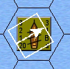 background to use as an indicator.
Instruct players to rotate the arrow, not the
unit. The unit data will still be legible; the arrow may look a bit
skewed, but no one is likely to complain. background to use as an indicator.
Instruct players to rotate the arrow, not the
unit. The unit data will still be legible; the arrow may look a bit
skewed, but no one is likely to complain.
ANTIALIASING
When working with any vector
object, including text, the question of antialiasing must be
considered. I think I can hear you asking – what the heck is
“antialiasing”?
Computers are good at drawing
lines in an orthogonal direction – 100% vertical or 100% horizontal. When
a line (any line) is drawn at some other angle, it will look jagged because it
is made up of discrete pixels offset slightly from each other.
 “Antialiasing” is a process by which
the computer applies shading to the line in such a way as to smooth out its
appearance. You can examine the effects of this by creating a vector text
object (upper case “S” will do) with and without antialiasing and zooming in on
it to 32:1 to examine each pixel. The effect of antialiasing will be
obvious. “Antialiasing” is a process by which
the computer applies shading to the line in such a way as to smooth out its
appearance. You can examine the effects of this by creating a vector text
object (upper case “S” will do) with and without antialiasing and zooming in on
it to 32:1 to examine each pixel. The effect of antialiasing will be
obvious.
PSP always gives you the option of
turning antialiasing on or off. As a general rule, turn it
on. There are some exceptions though. Very small text may look
better with antialiasing turned off. Or you may want a jagged appearance
on the edge of an object for some specific reason.
When it comes to labels
(remember, I mean partially transparent markers), you must turn antialiasing
OFF. Why? Because antialiasing works by varying the opacity of
pixels at the edge of the line, causing them to blend with the underlying layer
which, typically, is the transparent color. Once a transparent pixel
becomes blended with something else its RGB value changes and CB can no longer
recognize it as transparent, so it displays the pixel. The result is that
your carefully antialiased label will display in CB with an ugly cyan-like
border around the text or object. You have been warned.
CREATING CHARTS & TABLES
The quickest way to create
charts and tables for on-screen viewing is to use MS Excel. It
allows you to use text color and shading to differentiate individual rows,
columns or values. Do a screen capture into PSP, convert the image to a
bitmap, and load it into CB or ADC2 as if it were a map. For very large
charts or tables, you may have to do multiple screen captures and
"stitch" the images together in PSP.
|
|
MOVING ON
|
|
Lets wrap up our Operational Demo
Map. Make sure you have saved your demo map in PSP7
format.
|
|
Now is the time to reduce the color
depth of your map if you have decided to display the result in 256
colors. Use Colors>Decrease Color Depth>256 Colors to do
that. If you are using CyberBoard version 3, there is
no need to reduce the color depth to 16-bit color; CB will do that
automatically when you add the image to the
gamebox. Then, save the map again, this time as
a Windows bitmap file. PSP7 will warn you that all of the layers are
going to be merged into one and ask if you would like to continue. This
is the reason for saving the original of your map in PSP7 format first - the
bitmap file cannot retain the layers, vector objects, and other sophisticated
elements you have been working with. Select
"Yes".
|
|
Later, when you create a final,
finished product of your map, you will want to toggle the visibility of the
Counters layer and the Hex Grid layer to "Off" if you do not wish to
display these components in CB or ADC2.
|
|
To view the demo map in CB, run the
Design Module, Create a new map, hit the Edit button, click the Base Drawing
Layer button, and then load the Demo Map bitmap into CB using Edit>Paste
Bitmap From File.
|
|
To view the demo map in ADC2, run the
ADC2 Map Editor and select File>Create New Map Board. Click on the
"Use Scanned Map" button. This phrase is a misnomer -
ADC2 can actually display any windows bitmap, scanned or not, by this
method. Clear the check box called "Select and Position the BMP Map
Sheet", click the Change button, and then load your bitmap file. Set
the Zoom 3 hex size to 75 and the Orientation to "Hex Column".
Hit Continue and bring up the map display in the editor.
|
|
|
|
A
TACTICAL LEVEL MAP: MORE COMPLEX CLEAR TERRAIN
|
|
Now, let's work on a demo map
intended for a tactical level game. That will give us the chance to explore some
different, and somewhat more sophisticated, techniques. Open the Tactical.bmp file included in this package and examine it –
that is what we will build now. give us the chance to explore some
different, and somewhat more sophisticated, techniques. Open the Tactical.bmp file included in this package and examine it –
that is what we will build now.
|
|
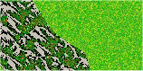
Undeveloped and uncultivated
"clear" terrain does not usually have a uniform appearance - it is a
mixture of different terrain types. We will build a clear terrain that
contains randomly sized and located patches of rough terrain, using layer
blending and a mask. This technique has other uses also; you
could use it, for example, to create a camouflage pattern.
|
|
Create a new 800 by 600 image, as you
did earlier. Flood fill the image with my Rough pattern. Then,
create a new raster layer and flood fill this layer with my Clear
pattern. Make sure the Clear layer is on top of the layer hierarchy and
the Rough layer is on the bottom.
|
|
Now, we will blend the 2 layers in such
a way as to make random patches of the bottom layer visible. To do this,
we will "mask out" random patches of the top layer.
|
|
A "mask" is a greyscale image
(i.e., an image composed only of black, white, and 254 shades of gray).
The mask is not itself visible; rather, it determines which portions of the
layer to which it is attached will be blocked, or masked, out of the visible
image.
|
|
We will attach our mask to the top
layer. Any portions of that layer that are masked will be replaced by the
bottom layer, which is allowed to show through. A pixel in the mask that
is black will completely block out the corresponding pixel in the top
layer. A white pixel in the mask will allow the corresponding pixel in
the top layer to show. A gray pixel in the mask will partially obscure
the corresponding pixel in the top layer (i.e., will alter its opacity) so as
to allow the pixel in the bottom layer to show partially.
|
|
Make sure the top (Clear) layer is
selected. Select Masks>New>Show All. This creates a
mask that is completely white. Now, select Masks>Edit to allow
yourself to draw on the mask itself. The mask is there, but you can't
see it. Select Black as the Foreground color.
|
|
We are going to draw a random, or
chaotic, pattern on the mask. Select Effects>Plug-in
Filters>EyeCandy 4000>Marble. Use these settings:
|
|
Vein Size = 70 pixels
Vein Coverage = 50%
Vein Thickness = 70
Vein Roughness = 50
|
|
Click OK. Then, select
Layers>Merge>Merge Visible to blend the 2 layers together as the
final clear terrain background. The resulting layer will be named
“Merged”. Rename it. Save the file as a *.psp file.
|
|

|
|
CREATING ADC2 OR CB HEX GRIDS
|
|
The next step is to add a hex
grid. This time, I will walk you through the process of making the
pattern.
|
|
To create an CB or ADC2 hex grid pattern, you must
first do a screen capture of a section of a
blank CB or ADC2 hex map
with the size and orientation of hexes you want, using the screen capture
process described above under "Obtaining Symbols". To see how
much of the map you need to capture, examine the file called
HexGridPatternDemo.bmp included with this package. do a screen capture of a section of a
blank CB or ADC2 hex map
with the size and orientation of hexes you want, using the screen capture
process described above under "Obtaining Symbols". To see how
much of the map you need to capture, examine the file called
HexGridPatternDemo.bmp included with this package.
|
|
Carefully select from the captured
image the portion that will constitute a "seamless"
pattern. The Hex Grid Pattern Demo has red lines to illustrate where you
should place your selection rectangle. (You can assist yourself in the process
of selecting the right area by using Guides and the "Snap to Guide"
function, which is explained in the PSP7 Help file.) When you have got
the selection exactly right, Copy the image to the Clipboard and then Paste it
into a separate image window.
|
|
As you can see, the grid is there but
the image is now entirely white. We now need to get rid of the white, so that
only the black grid remains.
|
|
Select Layers>Promote to Layer to
make the image capable of being rendered transparent. Select the Magic
Wand tool and then click in the centre of any hex. You have just selected
all of the white pixels in that hex. Now, from the Selections Menu, click
on Modify>Select Similar. As you can see, we have now selected all of
the white areas in the image. Hit the Delete key (or Edit>Clear) to
get rid of the white. Now click on Selections>Select None to get rid
of the selection marquee.
|
|
A PSP7 pattern containing
transparency (as this one now does) must be a native format
(*.psp) file, so
Save the result as a *.psp file to disk in your Patterns folder.
|
|
Now, create the hex grid in a separate
raster layer, as you did before, then save the file.
|
|
|
|
ADDING ELEVATIONS
|
|
Let's add some elevated ground
in the top area of the map. We will draw this elevation on the clear
terrain background.
|
|
Open the Layer Palette Window and
select the Clear layer. The changes you will make will only affect this
layer.
|
|
Click on the Freehand Selection
tool, which is the lasso icon. Set the Selection Type to Freehand and
the Feather Value to 0. Check the Antialias box.
|
|
Draw the outline of the elevated
terrain by drawing an irregular shape with the Freehand Selection tool.
The selection should run along the top, right, and left edges. You can
draw one which joins one or more edges of the image in the same way you drew
the coastline terrain feature earlier – by continuing to hold the left mouse
button down as you move the cursor out of the image frame and back around to
your starting point. As usual, do not release the mouse button until you
are near the starting point, to avoid a straight line.
|
|
Now click on Effects>3D
Effects>Outer Bevel to open the Outer Bevel window. Set the
following values:
|
|

Bevel = top row, third one from the
left.
Width = 20
Smoothness = 0
Depth = 20
Ambience = -10
Shininess = 0
Angle = 315
Intensity = 42
Elevation = 45
|
|
|
|
Click on the color box on the right
hand side to open up the Color Palette. Set the color to pure white, RGB
= 255, 255, 255.
|
|
You will want to retain these
settings for future use, so click on the Save As button and save them under
the name "Elevations".
|
|
Now click OK and you should see an
elevated area of terrain appear in the selected outline.
|
|
Click Selections>Select None to get
rid of the selection marquee and then repeat the entire process, drawing a
smaller selection area in the centre of the one you have already created.
This time, you will not have to enter the Outer Bevel values again as you saved
them earlier. Repeat the process a third time to give the map a hill with
three levels of elevation. Save the file.
|
|
The settings given above will place the
darkest side of the elevation outline facing towards the bottom right corner of
the image. Note that you can change the Angle setting to place the
darkest side in any orientation you wish.
|
|
But what if you want to draw an
elevation that is not a closed loop? You may need to draw an elevation, such as
a cliff side, which is not part of a closed loop or hill. To do so, first
draw a closed loop elevation in the manner described earlier. Then, use
the Freehand tool to select the portion of the hill that you want to convert
back into ground level terrain and flood fill (Match Mode=None) it again with
the pattern that was there before. Next, select the Paintbrush
tool and set:
|
|
Shape = Round
Size =
15
Hardness = 30
Opacity = 50
Step = 25
Density = 40
Build-up = On
|
|
Now, use the brush to paint the
appropriate pattern along the interior edge of the elevation to smooth out the
transition area. Voila – a cliff.
|
|
|
|
ADDING DEPRESSIONS
|
|
Adding an area of low ground, i.e., a
depression, is (you guessed it) essentially the converse of drawing
elevations. In the lower right corner of the map, use the Freehand
Selection tool to outline a depression on the Background layer (make sure
Antialiasing = On when doing this).
|
|
Now click on Effects>3D
Effects>Inner Bevel to open the Inner Bevel window. Set the
following values:
|
|
Bevel = top row, third one from the left.

Width = 20
Smoothness = 0
Depth = 20
Ambience = -33
Shininess = 0
Angle = 135
Intensity = 45
Elevation = 45
|
|
|
|
Set the color to pure white
again.
|
|
You will want to retain these settings
for future use, so save them under the name
“Depressions".
|
|
Now click OK and you should see a
depressed area of terrain appear in the selected outline. Save the
file.
|
|
When drawing a selection area using any
of the selection tools, it is very useful to know that you can add to your
selection at any time by holding down the SHIFT key. You can switch from
one tool type to another. You can create entirely separate selection
areas. For example, you could select a rectangular area with the
Selection Tool, then hold down the SHIFT key and use the Freehand Tool to
select another area in a different part of the image. You could then
switch to the Magic Wand Tool to select (while still holding down SHIFT) a
3rd area somewhere else. With all 3 areas selected, you could
then Flood Fill them all simultaneously.
|
|
If you select an area and then hold
down the CONTROL key while selecting another area (using any of the selection
tools) the second area will be deleted from the first. This can be
used, for example, to create 2 concentric selection circles for a doughnut-type
effect. I have created an entire castle moat this way.
|
|
If you create a useful and complex
selection that you want to preserve, you can save the selection itself to disk
using Selections>Save to Disk. Alternatively, you can use
Selections>Save to Alpha Channel; an “alpha channel” is saved as a
part of the *.psp file
itself, which is often more convenient.
|
|
|
|
COMPLETING THE TACTICAL MAP
|
|
Now, we will get some practice by
repeating the techniques learned earlier.
|
|
Create new vector layers for Terrain
and Text, and new raster layers for Symbols and Counters. Add an area of
Rough to the lower left of the map and 2 forests on the left side. Draw a
river (Line Width = 30) from right to left across the map and add a dirt road
(Line Width = 15) which follows the river and then crosses it. Add a
paved road or a stream if you wish.
|
|
Use building symbols to place a town
near the road. Label it with text, and label the map itself. Add
some counters.
|
|
Let’s draw a farming area in the lower
center of the map. The fields are vector objects -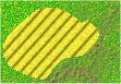 make them with the Field pattern in the usual way, but this
time rotate each of the patterns a bit for a more realistic look. Add a
couple of farm building symbols.
make them with the Field pattern in the usual way, but this
time rotate each of the patterns a bit for a more realistic look. Add a
couple of farm building symbols.
|
|
ADDING ATMOSPHERIC EFFECTS
|
|
There are a variety of atmospheric
effects you can add to your map, such as fog or mist. We will choose the
simplest one. We will turn the map into a suitable display for a
night-time scenario.
|
|
 Select Layers>New
Adjustment Layer>Brightness/
Contrast. In the window
that opens up, set the Brightness to -50 and the Contrast to 0. In the
Layer Palette Window, move the Brightness/Contrast layer to a position below
the counters, hex grid and text (as we don't want to darken these).
The map is now dark. If you want it darker still, simply decrease the
brightness again by right clicking on the Brightness/Contrast layer in the
Layer Palette Window, selecting Properties, and adjusting the brightness
downwards. Select Layers>New
Adjustment Layer>Brightness/
Contrast. In the window
that opens up, set the Brightness to -50 and the Contrast to 0. In the
Layer Palette Window, move the Brightness/Contrast layer to a position below
the counters, hex grid and text (as we don't want to darken these).
The map is now dark. If you want it darker still, simply decrease the
brightness again by right clicking on the Brightness/Contrast layer in the
Layer Palette Window, selecting Properties, and adjusting the brightness
downwards.
|
|
Tired of looking at a darkened
map? Open the Layer Palette Window and toggle the visibility of the
Brightness/Contrast layer off by clicking on the glasses icon. The
layer is still there, but it no longer has any effect on what you see - it is
"invisible". But it will be there if you need it again later
on.
|
|
Save the file. That wraps up the
Tactical map demo. Let’s discuss some techniques for making your own
patterns.
|
|
|
|
CREATING YOUR OWN PATTERNS
|
|
Although this is really the first step
in the process, I have left it to this point because it is the most time
consuming.
|
|
In general, there is no one
"right" way to create good patterns. It is a question of
playing around with the various capabilities of PSP7 (which are extensive)
until you find something you like. The most important thing is that
you take notes as you go along so that you can easily recreate a pattern
that you find usable. The other key to the process is learning to use the
EyeCandy 3.1 HSB Noise Filter. This filter is your best friend –
get to know it intimately.
|
|
There is a distinction between seamless
tile patterns and non-seamless patterns. A “seamless” tile is an image
that can be “tiled” (drawn repeatedly) onto any size of vector object or
selected area without any repetition of the pattern or side lines being
visible. Make a pattern seamless if you can.
|
|
Some patterns, like my stone pattern
included in this package, cannot be made seamless without a LOT of work.
The workaround for these is to make the pattern larger than the largest area or
vector object that you plan to draw. In effect, you should never use more
than one “tile” of a non-seamless pattern.
|
|
There is also a distinction between
patterns that contain transparency, like my forest pattern, and those that do
not. The latter can be stored on your hard drive as bitmap files and will
appear in the Pattern Selector Window when you search for them. A pattern
containing transparency, on the other hand, must be stored as a
*.psp file and must be
opened in a separate image window before you can use it.
|
|
|
|
CREATING SEAMLESS TILES
|
|
You may have noticed that PSP7 has a
Convert to Seamless Pattern command. I have not had good results using
it, and I recommend you ignore it.
|
|
Here is the method I use. Start
by creating a new image of 400 x 400 pixels with a white background in 24-bit
color.
|
|
The next step is to add a single color
that will serve as the base color, or starting point. It should be
a color that you want to be predominant in the final pattern. If your map
will eventually be displayed in CB in 256 colors (8-bit color depth), then the base color should be chosen
from the color palette in question. In this package, I have included
files containing the CB and ADC2 color palettes. You can use the Dropper Tool in PSP7 to
select colors from these palettes.
|
|
Let's walk through how I created
the Desert pattern. I started with a buff base color, RGB = 234, 235,
165. Use the Flood Fill tool to fill the image with this
color.
|
|
You could, of course, use a uniform
color like this for a desert but it wouldn't look very good. Uniform
colors do not have the "random" or "chaotic" appearance of
natural terrain. To rectify this, I used the HSB Noise Plug-In filter
that is part of the Eye Candy package included with PSP7. Select
Effects>Plug-In Filters>Eye Candy 3.1>HSB
Noise.
|
|
In the window that opens up, you will
see a variety of settings which you should play around with when looking for
the right pattern. For the Desert pattern, after much experimentation I
ended up with these settings:
|
|
Hue variation = 20
Saturation variation = 15
Brightness variation = 25
Opacity variation = 0
Lump Width (Pixels) = 1
Lump Height (Pixels) = 1
|
|
|
|
Enter these settings, and then click on
the Pencil beside the text box to save them under the name "Desert"
so you won't have to enter them again. Then click on the Tick Mark to
apply the noise to the pattern.
|
|
You may feel the resulting image is
okay, or you may feel it needs sharpening, depending on the look you are trying
for. To sharpen it, use the Unsharp Mask. Click on
Effects>Sharpen>Unsharp Mask. Again, these are settings you
should play around with, particularly the Strength value. As it happens,
the default settings seem appropriate for this pattern. Click on the box
in the lower right corner of the Unsharp Mask window to apply the default
settings.
|
|
The image now looks pretty good.
To create the final pattern, we need to cut out a swatch of it from the
centre. Click on the Selection Tool and set the Selection Type to
Square. Set Feather to zero and Antialias to off. Then, select a
100 x 100 pixel square from somewhere near the centre of the image. Hit
the Copy button, and then the Paste button to place the selection in a separate
image.
|
|
Save the small image as an
"*.bmp" file in your Patterns folder. It will now appear in the
Pattern Selection Box when you go to select a pattern.
|
|
To get you started, here are some base
RGB values and HSB Noise Filter settings which will approximate some of the
simpler terrain patterns included in this package:
|
|
TERRAIN
BASE RGB
HUE SAT. BRT.
OPAC. WID. HT.
|
|
|
|
Clear
128/183/57
25 25
15 0 1 1
|
|
Desert
234/235/165 20
15 25 0
1 1
|
|
Dirt
Roads
174/146/18 10
10 10 0 1 1
|
|
Paved
Roads
128/128/128 15 15
15 0
1
1
|
|
Deep
Water
36/41/248 15
15 15 0
5 1
|
|
Shallow
Water
133/185/243
7 7 7 0
5
1
|
|
Mud
192/146/48 10
10
10 0
5
2
|
|
|
|
 Note that the
Opacity Variation setting should never be greater than 0 unless the pattern is
being applied on top of some other pattern (e.g., Forest on Rough), in which
case a fairly high value would be appropriate. Note that the
Opacity Variation setting should never be greater than 0 unless the pattern is
being applied on top of some other pattern (e.g., Forest on Rough), in which
case a fairly high value would be appropriate.
|
|
|
|
CREATING NON-SEAMLESS PATTERNS
|
|
Let’s walk through the construction of
some non-seamless patterns. We will start with the Stone pattern included
in this package.
|
|
Open a new 400 x 400 pixel image (which
assumes that you will never apply this pattern to any area exceeding these
dimensions).
|
|
We want to start by flood filling the
image with a set of colors found in stone. Flood Fill this image with the
Cave Rock Blue pattern that comes with PSP7.
|
|
Those are the right colors, but we need
to rearrange them into a stone pattern. We will use one of PSP7’s filters
for that. Select Effects>Texture Effects>Tiles. In the
window that opens, enter these settings:
|
|
Tile Shape = hexagon
Tile
Angularity = 75
Tile Size =
8
Border Size =
1
Smoothness =
0
Depth =
1
Ambience =
0
Shininess =
50
Color =
white
Angle =
315
Intensity =
50
Elevation = 30
|
|
Save the resulting image as a *.bmp
file in your Patterns folder. Try drawing a stone wall with
it.
|
|
Want a stone floor? Do the same
thing, but change Tile Size to 32. 
|
|
Want a darker, sandstone color?
Use the Cave Rock Tan pattern instead. 
|
|
The HSB Noise filter makes the creation
of wave-like patterns easy. Let’s create a large ocean area. This
time, we will build the pattern right in the map image.
|
|
Open an 800 by 600 pixel image
window. Flood fill it with a deep blue, RGB = 2, 2, 180. Apply the
HSB Noise filter TWICE in a row, with these settings: 0/0/7/0/30/4. (In order,
the settings expressed this way are: Hue, Saturation, Brightness, Opacity,
Width, Height.) The resulting image has a dark, wavy pattern suitable for
an ocean area.
|
|
Want a lake in a lighter shade of
blue? Use RGB = 5, 146, 255 and apply the HSB Noise filter twice, as
before.

|
|
Looking for a snow-covered
landscape? Flood fill the image with (hmmm, let me think a bit . . . )
white, RGB = 255, 255, 255 and apply the HSB Noise filter twice, as
before. 
|
|
|
|
BLENDING LAYERS
|
|
For many patterns, a much more natural
look can be achieved by blending layers. To illustrate this, we will
construct a complex clear terrain pattern.
|
|
Start with a base color of medium
green, RGB = 0, 188, 0. Flood fill a 400 x 400 image with it. Add HSB
Noise: 25/25/15/0/1/1.
|
|
Create a new raster layer and flood
fill it with a gray/brown, RGB = 177, 153, 103. Add HSB Noise:
10/10/5/0/1/1.
|
|
Switch to the green (background) layer,
use Layers>Promote to Layer to make it movable, and then move the green
layer to the top of the layer hierarchy.
|
|
Add a mask to the top (green) layer,
using the procedure outlined above, and select Masks>Edit. This time,
we will use PSP7’s own Noise Filter (as the EyeCandy filter has difficulty
writing onto a mask). Select Effects>Noise>Add. Set
Noise = 100% and choose the Random option. Click OK, then apply the same
filter a SECOND time. Finally, use Layers>Merge>Merge Visible to
combine the 2 layers permanently.
|
|
Now, create a new raster layer and
flood fill it with a medium yellow, RGB = 232, 240, 0.  Add HSB Noise:
10/10/5/0/1/1. Move the yellow layer to the bottom of the hierarchy and
apply a mask, followed by noise, to the top layer just as you did
earlier. Do that twice. Then, merge the layers and create a seamless
tile. Add HSB Noise:
10/10/5/0/1/1. Move the yellow layer to the bottom of the hierarchy and
apply a mask, followed by noise, to the top layer just as you did
earlier. Do that twice. Then, merge the layers and create a seamless
tile.
|
|
The result is a clear pattern
containing a good blend of greens, browns, and yellows.
|
|
|
|
USING TEXTURES
|
|
Many terrain types are not smooth, but
textured. My Rough pattern is an example. Let’s build
it.
|
|
Start with a gray/brown, RGB = 177,
153, 103. Flood fill a 400 x 400 window with it. Add HSB Noise:
10/10/5/0/1/1.
|
|
At this point, we will add a
texture. Select Effects>Texture Effects>Texture. Apply
the following settings:
|
|
Texture = #2
Size = 100%
Smoothness = 0
Depth = 1
Ambience = -10
Shininess = 0
Color = white
Angle = 315
Intensity = 45
Elevation = 30
|
|
Let’s blend a bit of clear terrain into
the rough. Flood fill another raster layer with clear terrain, then
apply Layers>Promote to Layer and move the textured layer to the top of the
hierarchy. (We always want the layer that will predominate in the
final blend to be on top.) Add a mask to the top layer, apply PSP7’s
noise filter twice to the mask (as you did before) and merge the 2
layers.
|
|
There you have it – the rough terrain
pattern, with a distinctive rough texture.
|
|
Another good use of a texture is to
make a Field pattern. Flood fill a 500 x 500 image with medium yellow,
RGB = 239, 228, 55. Apply HSB Noise: 15/15/15/0/2/2. Then, apply
Effects>Texture Effects>Texture with these settings:
|
|

Texture = #9
Size = 4
Smoothness = 30
Depth = 10
Ambience = 35
Shininess = 0
Color = white
Angle = 320
Intensity = 50
Elevation = 20
|
|
Use Image>Resize (Resize Type
= Pixel Resize) to resize the image to 25%.
|
|
Use the Crop Tool to crop a few pixels
off the edges, and you have a usable field pattern.
|
|
There are other capabilities of PSP7
you should investigate when creating your own patterns. I have used the
Pixelate Effect and the Swirl Filter on some occasions. Again, it is a
question of experimentation and taking notes.
|
|
|
|
A
MAN TO MAN LEVEL MAP: USING PICTURE TUBES
|
|
What the heck is a picture
tube? That is PSP7’s name for a tool that can select at random one of
several small images, which may be partially transparent, and paste it into
your image. This is the perfect tool for adding trees, bushes and rocks
to a man-to-man scale map (which, graphically speaking, is my favourite
scale). Let’s take it for a spin.
|
|
Flood fill an image with clear
terrain. This time, we will not bother with a hex grid.
|
|
 Start by
drawing a small, windowless stone building with a wood floor. Put it in
the top right corner on a new vector layer. Select the Preset Shapes
Tool and choose the Rectangle shape. The Retain Style and Antialias
boxes should be left unchecked but the Create as Vector box should be
checked. Set the Foreground pattern to my Stone pattern, the Background
pattern to my Wood pattern, and the Line Width to 40 (the width of the
walls). Draw a rectangular building. Start by
drawing a small, windowless stone building with a wood floor. Put it in
the top right corner on a new vector layer. Select the Preset Shapes
Tool and choose the Rectangle shape. The Retain Style and Antialias
boxes should be left unchecked but the Create as Vector box should be
checked. Set the Foreground pattern to my Stone pattern, the Background
pattern to my Wood pattern, and the Line Width to 40 (the width of the
walls). Draw a rectangular building.
|
|
Then, set the Foreground pattern to
Wood and the Line Width to 1 and zoom in to draw a doorway on the south
wall. (I leave the windows to you, as an exercise.) Select both
building and doorway, and rotate them a bit
counter-clockwise. 
|
|
At this scale, larger objects look a
lot better if a “drop shadow” is added to them to provide
perspective. Here, we bump up against a limitation of PSP7 – drop
shadows can only be added to a raster layer, but the building is on a
vector layer. However, there is a workaround.
|
|
With the building still selected as a
vector object, select Selections>From Vector Object. 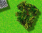 That creates a “raster-style”
selection box. Now make the clear terrain layer (which is a raster layer)
the active layer. Select Effects>3D Effects>Drop
Shadow. Apply the default settings and click OK. The building
now looks as if the sun is shining on it from the northwest (top left) around
mid-afternoon. Having adopted this convention about the time of day and
the sun position, we must be sure to stick to it consistently on this
map. That creates a “raster-style”
selection box. Now make the clear terrain layer (which is a raster layer)
the active layer. Select Effects>3D Effects>Drop
Shadow. Apply the default settings and click OK. The building
now looks as if the sun is shining on it from the northwest (top left) around
mid-afternoon. Having adopted this convention about the time of day and
the sun position, we must be sure to stick to it consistently on this
map.
|
|
Create a new raster layer for the trees
and the bushes. (You should get into the habit of placing different
types of objects in separate layers.) Go into your Preferences
settings and ensure that your Tubes file location points to the Tubes folder
supplied with this package. Click on the Picture Tube tool, open the
Tube Selector Window, and select my “Trees” tube (do not confuse it with
PSP7’s Summer Trees tube).
|
|
My tube contains 6 (somewhat) different
trees. Each time you click on the image, one of the 6 trees, chosen
at random, will be added. Add 2 or 3 now. Then, use the Magic Wand
to select each tree (set Match Mode = All Opaque, as the trees are surrounded
(on their own layer) by transparency) and add a drop shadow to it.
|
|
Switch to the Bushes layer, select my
Bushes Tube (containing 4 types of bushes), and add some bushes near the
trees.
|
|
Finally, select my Rocks Tube
(containing 12 types of rocks) and add a few rocks in random locations.
(Acknowledgement: the Bushes and Rocks tubes are adaptations of PSP7’s Summer
Trees and River Rocks tubes.) 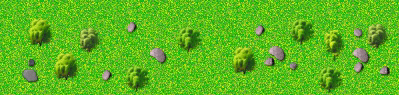
|
|
Save the file. That’s it for the
man to man demo map, and this tutorial.
|
|
|
|
FINAL
THOUGHT
|
|
Believe it or not, there is still more
you can do with PSP7 to create good-looking maps and counters. This memo
gives you the basic techniques, but there are a lot of additional touches you
can discover through experimentation. Try out the filters. Take
notes.
|
|
And, if you figure out how to draw a
rail line that doesn’t look like a centipede, send me an email ...
|
|
|
|
Alex Henderson
Version 2.5
March
23/05
alexhenderson7@yahoo.ca
|